Real-Time Shopping SaaS
END-TO-END MVP PRODUCT DESIGN
FOR ONOFFLINE SHOP
FOR ONOFFLINE SHOP
Turning in-mall livestreams into a mobile checkout experience
%20(2).gif)
🗂️ Overview
OnOffline Shop is a mobile-first live-commerce platform where shoppers hire on-site streamers to shop in real time. The team needed end-to-end UX/UI for the buyer app, provider app, and admin console to launch an MVP combining live video, cart, and one-tap checkout in one seamless flow
Goal
Launch a mobile-first MVP (Buyer • Provider • Admin) that merges live video, real-time chat, and one-tap checkout into a single shopping experience
My Role
Sole Product Designer →
- UX Research
- UX/UI Design
- Design System
- Prototype
- Handoff
Timeframe
~6 months · 2019
Key Outcomes
- Delivered complete UX for all three roles
- Live-demo MVP secured first mall partnership and early users
- 25% uplift in provider-request conversion,
50 % faster shopping journey
💥 Problem Statement
How might we let remote shoppers hire an on-site “provider,” guide a live stream, add items to cart, and check out in ≤ 10 minutes—while providers go live with < 5-minute setup and admins retain real-time oversight?
from pain → to plan
💻 Process
Initial Audit & Design Alignment
Reviewed all existing assets—pitch deck, sketches, competitor notes, and flow draft. Created a kickoff questionnaire covering KPIs, user value, streaming limits, and budget. The responses shaped product goals and design direction
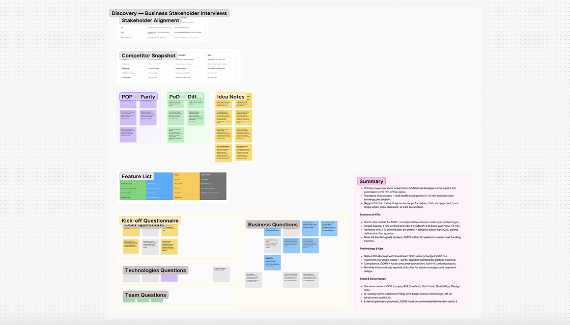
Research — Competitor Analysis
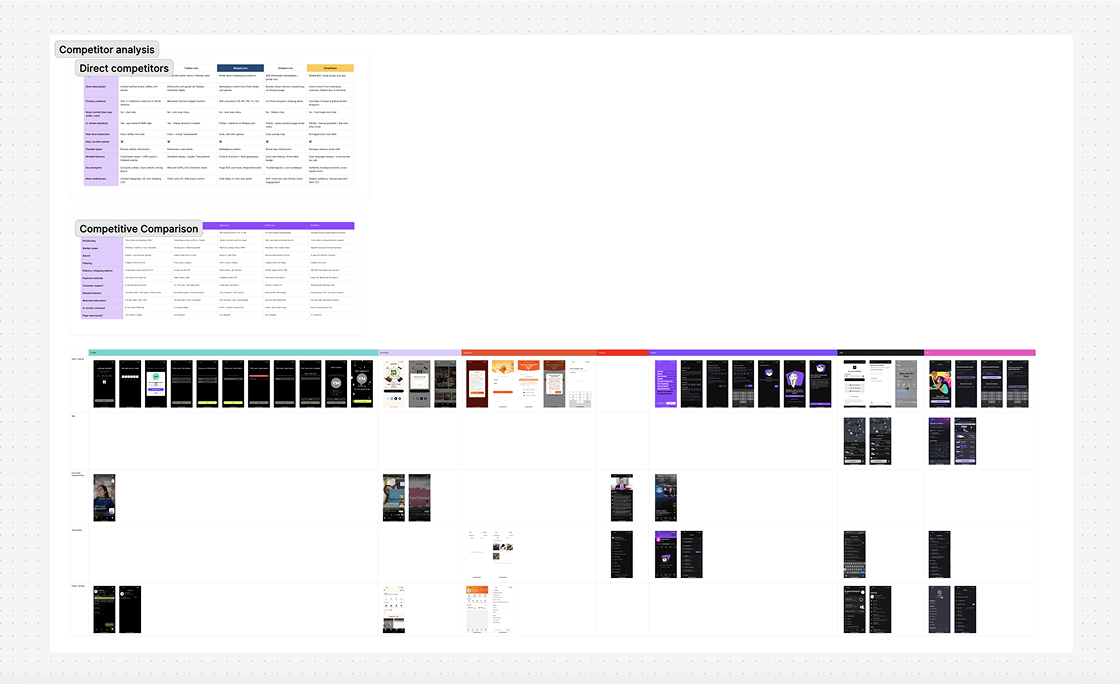
After kickoff, I analyzed top live-commerce and real-time apps like Taobao Live, Shopee, Uber, and Grab. I summarized findings in a POP-POD matrix, feature grid, and UI audit. Ride-sharing flows shaped the map logic, while marketplace checkouts inspired the in-stream cart—helping set MVP priorities and roadmap.
Research Summary
I consolidated stakeholder input and market findings into a concise view of our target users and their core pain points
Remote Shopper
Lina, 25
Jakarta-based marketing executive, loves fashion but lacks time for malls; shops via phone during commutes
Pain: Has no clear way to see final price or delivery options during a live stream; hesitates and often abandons the order
Provider / Streamer
Reiko, 22
Freelance “shopping assistant” who accepts gigs via the app, livestreams store visits, and earns commission on completed orders
Pain: Current tools require multi-app juggling (video, chat, notes). Setting up a stream and a cart simultaneously is tiresome
Operations Admin
Mei, 30
Oversees order flow, verifies new providers, and ensures stream quality to protect brand trust
Pain: Manually cross-checks orders, payments, and stream quality across three dashboards—time-consuming and error-prone
Role Based MVP Feature Matrix
I defined the core MVP features for Buyers, Providers, and Admins, mapping key tasks to help engineering prioritize high-impact workflows
Role
Critical user flows to cover
Admin
Register / Login → Map & Provider Pick → Live Stream Interaction → Add to Cart & Checkout → Order History → Profile & Settings
Vendor
Register / Login → Accept Order → Start Stream → Add Items to Cart → Confirm Purchase → Profile & Support
Buyer
Sign-in → Verify Users / Providers → Manage Orders → Approve Mall Partners → Control Tariffs & Payments → Reports
🗃️ Assumptions
1. Fragmented remote shopping options: Buyers currently switch between chat, video, and payment links, making remote purchases slow and unreliable
2. High friction for first-time providers: Vendors often abandon new B2B platforms because a 10-step onboarding (CSV uploads, certificates, tax forms) stands between them and submitting that critical first offer
3. Need for instant, transparent savings: Consumer buyers join group-buy pages expecting to see how much they will save and when the deal closes; if the discount meter or timer is unclear, they drop the cart within seconds
4. Admin blind spots on live sessions: Operations teams can’t track live streams, orders, or payments in real time—problems show up only after complaints.
🚀 Solution
I partnered with PM and engineers to validate streaming limits and proposed a step-by-step plan for stakeholder approval
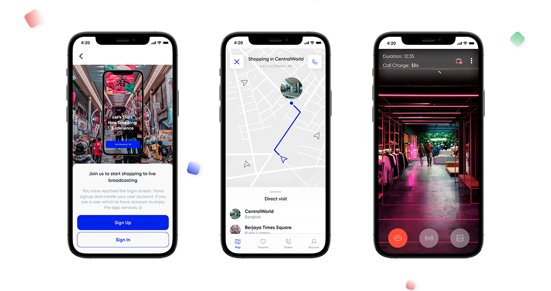
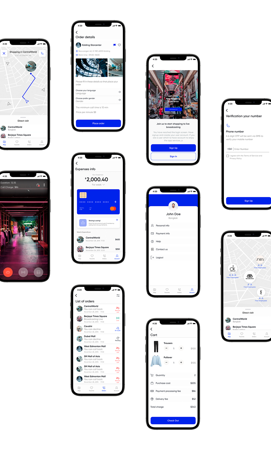
Seamless Live-Shopping Flow: All-in-one interface with live video, chat, item selection, and checkout—no need to switch apps
One Tap Go Live for Providers: In-app camera, cart, and order tracker in one toolkit—stream setup takes under 5 minutes
Transparent Price & ETA Overlay: Item cost, delivery fee, and ETA always visible on-screen—reduces cart abandonment
Real Time Ops Dashboard: Live dashboard for streams, orders, and payments—helps admins catch issues early and scale onboarding confidently
from plan → to solution
🏗️ Wireframing
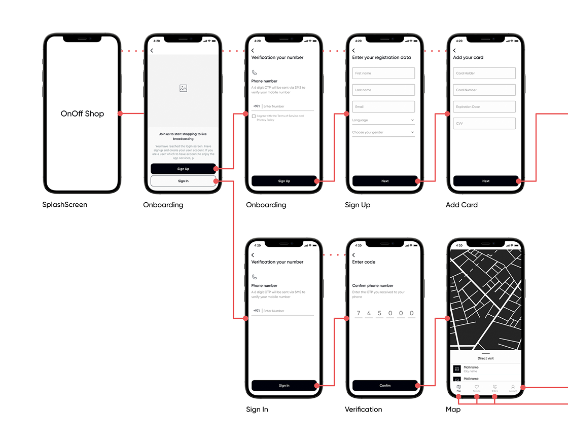
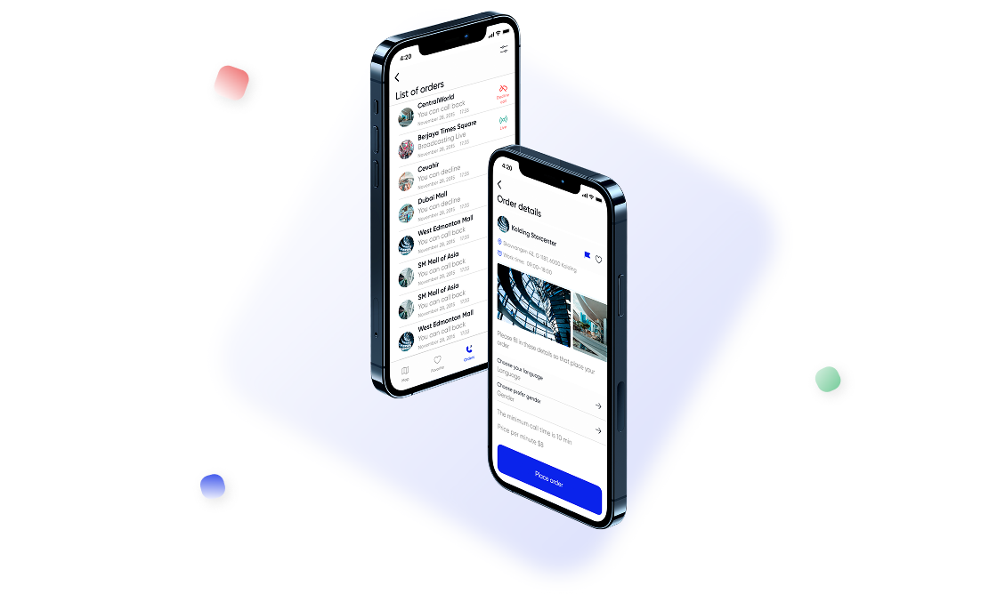
To support precise mobile flows, I turned early sketches into focused wireframes for Buyer, Provider, and Admin—covering map, cart, order queue, and dashboard. Early approval locked the logic and enabled a smooth handoff to hi-fi and dev with no rework
🚧 Design Handoff
As wireframes took shape, I built a lightweight Figma UI kit—tokens, type, spacing, and components—to keep visuals consistent, speed up design, and reduce dev rework
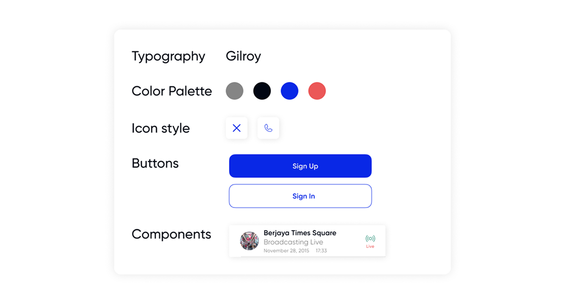
I provided platform-specific Figma specs and synced daily with iOS and Android teams. Weekly reviews kept screens aligned across both apps and minimized QA rework
📊 Outcome
- ↓ 50 % buyer shopping time thanks to remote live-stream flow
- ↑ 25 % conversion from provider requests to accepted streams
- Cart completion lifted to ≈ 70 % via in-video checkout
Let’s build the future together
From MVPs to growth stage — I help teams transform ideas into experiences
 Schedule a Call
other projects

